
Danilson Law is a family run Iowa real estate law firm, established in 2015, that handles one thing: Iowa real estate. Four very different people arrive at their website with four very different questions, and the old answer was to make all of them read the same page. We built a site that sorts them out in about twenty seconds and then speaks to each one directly.

THE BRIEF
One firm, four audiences, one homepage
A seller wants to know what happens after they accept an offer. A buyer wants someone to read the purchase agreement before they sign it. A real estate agent is shopping for a closing partner and is really asking whether you will make them look good in front of their client. An investor wants to know if you can close in the name of an LLC and file the federal FinCEN report without being reminded.
Those are four different conversations. Most law firm websites flatten them into a practice area list and let the visitor sort themselves out. The brief here was the opposite: let the site do the sorting, then give each audience a page written entirely for them, in plain English, with the fee structure stated up front rather than buried behind a consultation.
SEGMENTATION
A path finder that does the sorting
A visitor meets the question before they meet the marketing. An entry panel asks what brings them here today and offers four answers, each with a one line clarifier so nobody has to guess which box they belong in. Anyone who would rather browse can skip it in one click, and the choice is not permanent, so a buyer who turns out to be an investor is never stuck.
The same chooser lives inside the hero as a persistent module, so the decision is still available to anyone who dismissed the panel or landed deeper in the site. Below the fold it appears a third time as a numbered list, this time with a sentence of substance behind each path rather than a label.


THE FOUR PATHS
Four destinations, each written for one reader
Every path lands on a full page built to the same skeleton and filled with completely different content. A numbered spine runs down the left of each one, so a visitor always knows where they are: what we handle, how the process runs, what it costs, and the questions this particular audience actually asks.
- Sellers get contracts, abstract and title work, and closing, framed around the moment an offer arrives.
- Buyers get purchase agreement review and the legal detail behind what they are about to sign.
- Agents get a partnership pitch rather than a service list, including an invitation to try the firm on a single closing with no agreement required.
- Investors get entity titled closings, stacked timelines, and the federal FinCEN reporting requirement handled as part of the closing.
The FAQ blocks are path specific too. The question an agent asks is whether their existing attorney is a problem. The question an investor asks is whether you can close in the name of their LLC. Neither of those belongs on a seller page, so neither is there.


PRICING
Fees you can compare without a phone call
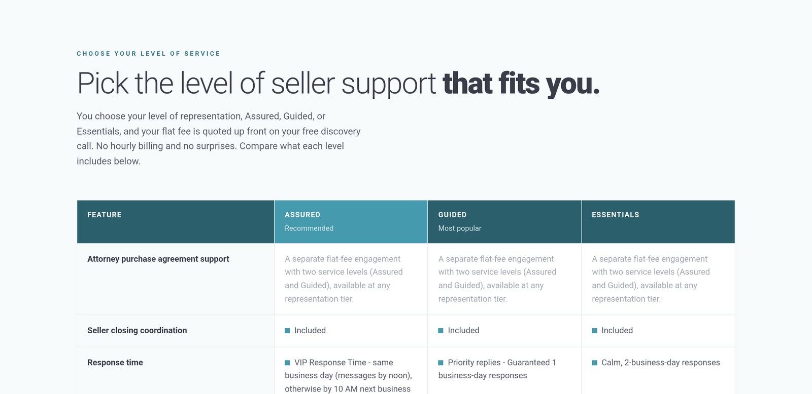
The firm sells flat fees, so the site had to make flat fees legible. Three service levels sit in a single comparison table, and the rows are the things a client would actually weigh: guaranteed response time, access to the transaction tracker, remote online notarization, whether non litigation title clearing is included or billed separately, and whether a CPA tax consultation comes with it.
The table does not hide the awkward rows. Where something is billed separately it says so, with the range, and a footnote explains exactly what the fee does and does not cover. That is the whole argument the firm makes about itself, rendered as a table.
PRODUCT
Showing the product instead of describing it
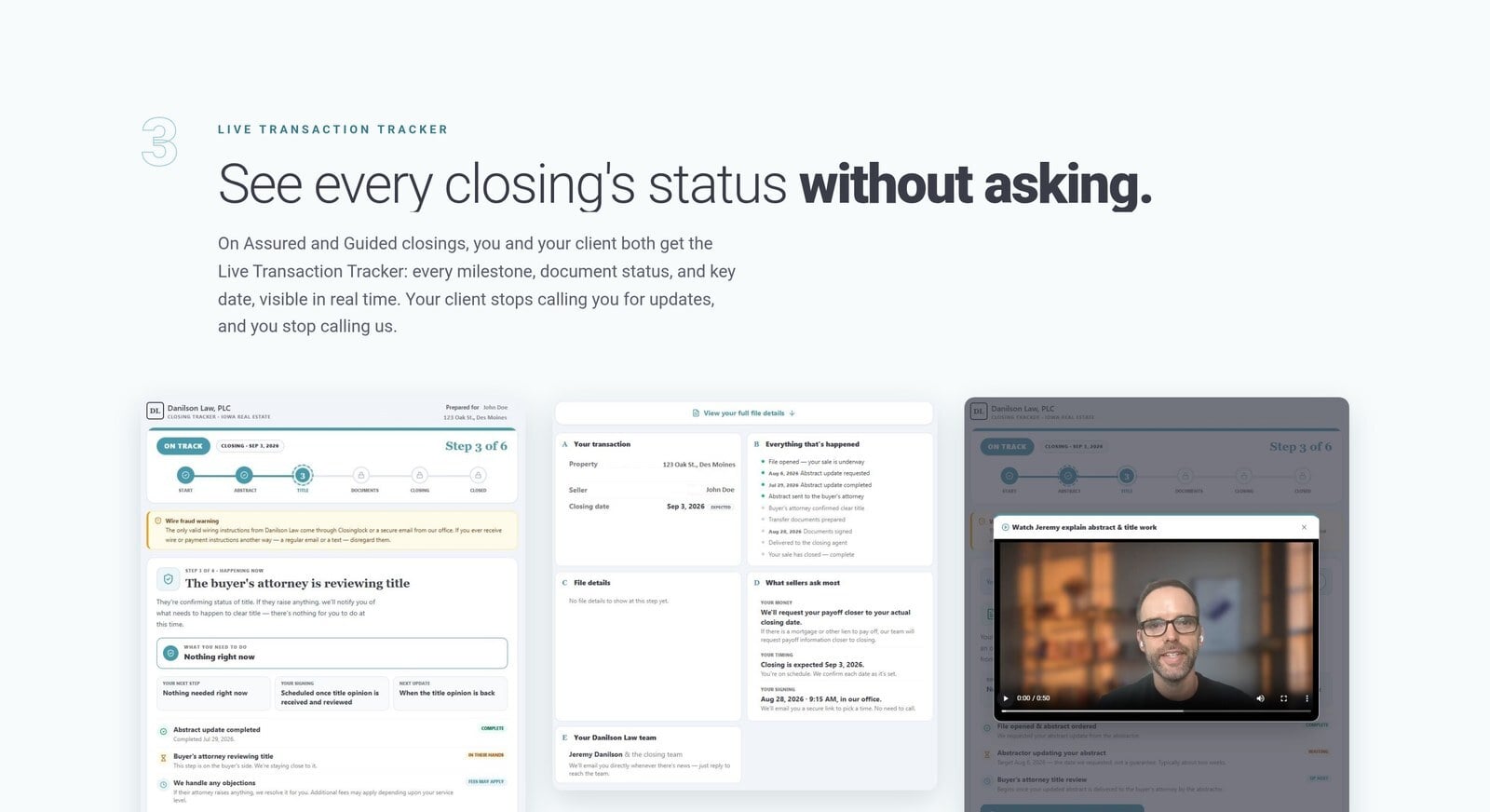
The firm gives clients and their agents a live transaction tracker, which is the kind of feature that sounds like nothing in a bullet point. So the site shows it: real interface screens, at an angle, with the milestone view, the document detail and the attorney video update all visible at once. A caption underneath states plainly that the screens use a demonstration file and are not an actual client's details.
PROOF
Proof in the client's own words
The review section pulls excerpts from Google and Facebook and labels each reviewer by their role in the transaction, so a seller reads a seller, a buyer reads a buyer and an agent reads an agent recommending the firm to their own clients. The excerpts are marked as excerpts and the section links out to the full set rather than pretending these are all of them.

RESPONSIVE
Built to hold up on a phone
Most of this traffic is somebody reading in a parking lot between showings. The path finder becomes a stacked card list, the four path rows become full width blocks with the second one inverted to keep the rhythm, and the type scale stays large enough that nothing needs pinching. Every screen keeps the discovery call within reach.

THE BUILD
What it runs on
The site is built on HubSpot CMS with a custom theme, which puts the pages, the blog, the forms and the meeting booking in one place instead of stitched across four tools. Practical consequences of that choice show up throughout:
- A resource library of long form Iowa real estate articles, covering abstracts, groundwater hazard statements, quit claim deeds, tax sales and the rest of the questions clients arrive with.
- Accordion FAQs on every path page plus a full site wide FAQ, so the answers are indexable rather than trapped in a PDF.
- A single conversion action, the free fifteen minute discovery call, repeated at the end of every section instead of a scatter of competing CTAs.
- Live chat on every page for the visitor who is not ready to book but is ready to ask.
danilsonlaw.com